Themes Overview Chart
Understanding Themes in Agile Project Management
Before we delve into the Themes Overview Chart, let’s take a moment to understand the concept of themes in agile project management. Themes are a vital element used to track business initiatives, purchase orders, or any other significantly important areas within your projects. They help you categorize and group related backlog items, providing a clear view of how these items contribute to your business goals.
Unveiling the Themes Overview Chart
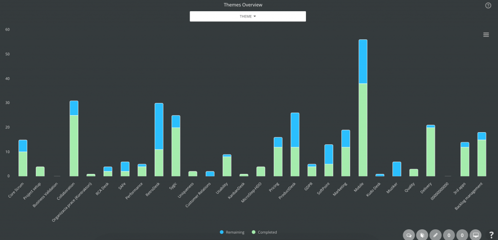
The latest ScrumDesk version takes your project management experience to a whole new level with the Themes Overview Chart. This feature empowers you to focus on the most critical themes in your projects by enabling theme filtering. Product owners and project managers can easily select one or multiple themes and compare them side by side, helping them make more informed decisions.
Key Features of the Themes Overview Chart
The Themes Overview Chart offers a range of functionalities to provide you with a comprehensive view of your project’s themes:
1. Customizable Chart Views
The chart can be customized to display various metrics, allowing you to choose the perspective that suits your needs. You can switch between the following views:
- Number of Backlog Items: Gain insights into the quantity of backlog items associated with each theme.
- Effort in Story Points: Understand the level of effort required for each theme.
- Time Perspectives: Get a timeline-based view of how themes progress over time.
2. Comparison of Remaining Work and Completed Work
With the Themes Overview Chart, you can easily compare the remaining work and the work already completed for each theme. This comparison provides valuable data to assess the progress of your themes and make adjustments as necessary.
Benefits of the Themes Overview Chart
The Themes Overview Chart in ScrumDesk offers several advantages for agile project management teams:
- Enhanced Focus: By filtering themes, you can direct your attention to the most critical aspects of your project, ensuring you’re always working on what matters most.
- Improved Decision-Making: The ability to compare themes using different metrics allows for data-driven decision-making, leading to more effective project management.
- Efficiency and Productivity: With a clear view of remaining work and completed work, teams can better track progress and optimize their workflow.
In conclusion, the Themes Overview Chart in ScrumDesk is a game-changer for agile project management. It empowers teams to track and manage their projects more effectively, leading to improved efficiency and productivity. With customizable chart views and the ability to compare themes, this feature is a must-have for teams looking to stay ahead in the world of agile project management. Upgrade to the latest version of ScrumDesk today and experience the difference for yourself!
Backlog Item Types over Time
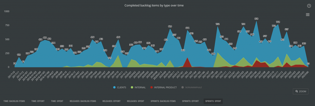
In the world of agile project management, understanding how your team invests their effort in backlog items over time is crucial. Are you diligently working on business requirements, or have technical user stories slipped through the cracks? What’s the overall product quality, and how have the number of bugs evolved over time? These questions are at the heart of effective project management, and ScrumDesk’s Effort Analysis Chart is here to provide the answers.
Uncover the Story of Your Efforts
The Effort Analysis Chart is a powerful tool that allows you to gain deeper insights into your team’s efforts over time. It provides a visual representation of how your team’s work is distributed, helping you make informed decisions and improvements.
Key Features of the Effort Analysis Chart
The chart offers a range of features to enhance your understanding of your project:
- Number of Items: This view shows you the distribution of work based on the number of backlog items, offering insights into the quantity of work done.
- Effort in Story Points: Understand the effort invested in terms of story points, helping you evaluate the complexity of your tasks.
- Spent Time: Get a time-based perspective of how your team invests their time in various aspects of your project.
Comprehensive Progress Insights
The Effort Analysis Chart not only provides daily progress data but also allows you to view data based on releases and sprints. This comprehensive view enables product owners to track progress at different scales, making it easier to identify trends and areas that require attention.
Benefits of the Effort Analysis Chart
ScrumDesk’s Effort Analysis Chart offers several advantages for product owners and project managers:
- Informed Decision-Making: With a clear view of how effort is distributed, you can make data-driven decisions to improve your project’s efficiency and effectiveness.
- Identify Imbalances: Discover if you’re overlooking critical technical user stories or if there’s a disproportionate focus on business requirements.
- Monitor Quality and Bugs: By tracking the quality of your product and the number of bugs over time, you can ensure a smoother and more successful project.
In conclusion, the Effort Analysis Chart in ScrumDesk is a valuable tool for gaining insights into your project’s efforts over time. Whether you’re focused on business requirements, technical user stories, or product quality, this chart empowers you with the information you need to steer your project in the right direction. Make sure to explore this feature in ScrumDesk to enhance your project management experience.
Sprint and Release BurnUp Charts
In the dynamic world of agile project management, teams have their unique preferences when it comes to visualizing project progress. Some teams swear by the burn-down chart, while others are motivated by adding value to the product and lean toward BurnUp charts. ScrumDesk, always at the forefront of agile project management, offers a robust BurnUp Chart feature to cater to the diverse needs of agile teams.
Choosing Your Progress Visualization
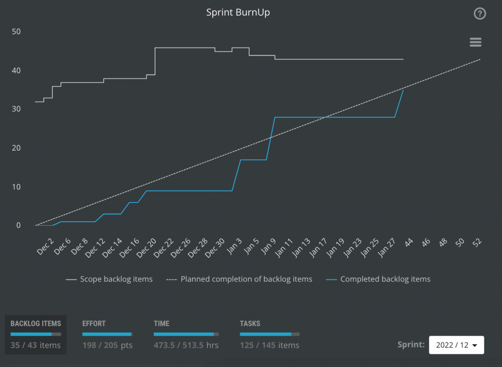
The BurnUp Chart is a versatile tool that provides you with a clear and insightful perspective on how work is added over time in comparison to the total work scope. It’s particularly valuable for teams that prioritize adding value to the product and appreciate a more comprehensive view of their project’s progress.
Key Features of the BurnUp Chart
ScrumDesk’s BurnUp Chart offers a range of features to help you effectively visualize and manage your project’s progress:
- Work Added Over Time: This view allows you to monitor how work is steadily added to the project, providing a visual representation of your ongoing efforts.
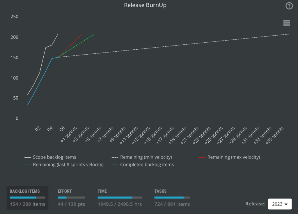
- Progress Predictions: ScrumDesk goes a step further by predicting the daily progress that should be added. This valuable feature assists in planning and decision-making, ensuring your project stays on track.
- Release BurnUp Chart: For teams looking to gauge when their release will be completed, ScrumDesk offers a Release BurnUp Chart. It provides predictions based on various factors, including minimum, last 8 sprints, and maximum velocities.
Benefits of the BurnUp Chart
Embracing the BurnUp Chart in ScrumDesk offers several advantages for agile teams:
- Value-Centric Approach: For teams motivated by adding value to the product, the BurnUp Chart is an ideal choice. It helps track progress in terms of work added, aligning with the goal of delivering value.
- Predictive Insights: The chart’s predictive capabilities enable teams to plan with confidence and make informed decisions about their project’s trajectory.
- Release Completion Forecast: The Release BurnUp Chart empowers teams to predict when their release will be completed, helping with timelines and resource allocation.
In conclusion, ScrumDesk’s BurnUp Chart is a valuable asset for agile teams that focus on adding value to their product and prefer a different perspective on project progress. Whether you need daily progress predictions or insights into release completion, this feature equips you with the tools you need to stay on top of your project. Explore the BurnUp Chart in ScrumDesk to experience the benefits for yourself and ensure your agile project management is on the right track.
Backlog Item by Tags
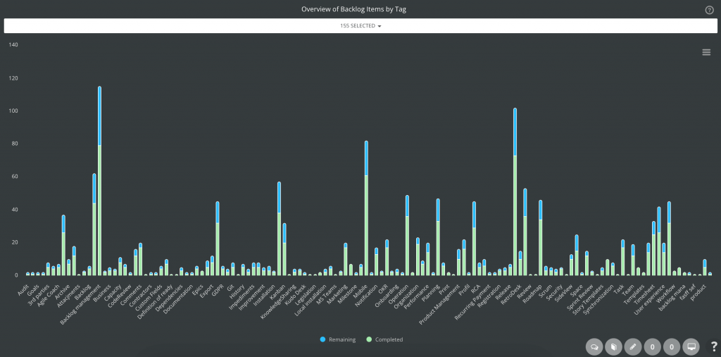
In the realm of agile project management, efficiency is the name of the game. If you’re looking to understand your Product Backlog faster, ScrumDesk has the perfect solution: the Overview of Backlog Items by Tag chart. This nifty feature will change the way you manage and organize your backlog.
Unleash the Power of Tags
Are you making the most of tags to streamline your Product Backlog? If not, you’re in for a treat. ScrumDesk’s Overview of Backlog Items by Tag chart offers a comprehensive view of the implementation status for every tag used in your Backlog, allowing you to grasp the big picture at a glance.
Key Features of the Tag Overview Chart
ScrumDesk’s Tag Overview Chart is packed with features to supercharge your backlog management:
- Remaining vs. Completed Work: Whether you’re interested in time or effort perspectives, this chart provides insights into the remaining and completed work associated with each tag.
- Filtering Capabilities: Tailor your view by filtering tags to focus on the most crucial product areas. This level of customization ensures you can zero in on what matters most to your team.
Benefits of Tag Insights
The Overview of Backlog Items by Tag chart in ScrumDesk offers several advantages:
- Efficient Understanding: Quickly gain insights into the implementation status of each tag in your backlog, saving you time and effort.
- Detailed Progress Tracking: Understand the remaining vs. completed work, whether you’re viewing it from a time or effort perspective.
- Tailored Focus: The ability to filter tags ensures that you can concentrate on essential product areas, helping you make more informed decisions.
In conclusion, ScrumDesk’s Tag Overview Chart is your ticket to efficient Product Backlog management. Whether you’re using tags or want a streamlined way to grasp your backlog’s implementation status, this feature has got you covered. Don’t miss out on the opportunity to enhance your agile project management – explore the Tag Overview Chart in ScrumDesk today!
Storypoints vs Time Chart

In the world of agile project management, accurate estimation is the cornerstone of successful planning and execution. If estimation holds significance for your team, ScrumDesk’s Storypoints vs. Time Chart is the feature that you don’t want to miss.
The Power of Accurate Estimation
Accurate estimation is pivotal for agile teams striving to meet their project goals effectively. ScrumDesk’s Storypoints vs. Time Chart acknowledges that not all teams estimate the same way. Some use hours or man-days, while others opt for story points. In certain cases, user stories are estimated with story points, while subtasks are estimated with hours. This diversity in estimation methods can make it challenging to assess the accuracy of your estimates.
Key Features of the Storypoints vs. Time Chart
ScrumDesk’s Storypoints vs. Time Chart provides a transparent understanding of your estimation accuracy:
- Comparing Estimation Methods: This chart enables you to compare time-based estimation with story point-based estimation. This side-by-side comparison sheds light on the accuracy of your estimates.
- A Valuable Catalog: Product owners will benefit from having a catalog of data to refine their estimation processes. It can be instrumental in breaking down requirements into smaller, manageable parts that can be delivered within a sprint.
- Predictive Delivery: Scrum Masters can use the insights gained from this chart to assist agile teams in establishing predictive delivery, ensuring that future sprints are more accurate and reliable.
Benefits of the Storypoints vs. Time Chart
ScrumDesk’s Storypoints vs. Time Chart offers several advantages:
- Improved Estimation Accuracy: By comparing different estimation methods, you can identify areas where your team’s estimates may be more or less accurate, leading to better planning.
- Enhanced Catalog: Product owners can utilize this catalog to fine-tune requirements and improve overall project management.
- Predictive Delivery: Scrum Masters can support teams in making more reliable predictions for future deliveries.
In conclusion, ScrumDesk’s Storypoints vs. Time Chart is a vital tool for agile teams looking to enhance their estimation accuracy and, in turn, their project success. Whether you’re interested in fine-tuning your estimation methods or establishing predictive delivery, this feature is a must-have. Don’t miss out on the opportunity to elevate your agile project management – explore the Storypoints vs. Time Chart in ScrumDesk today!
Finally
In the ever-evolving realm of agile project management, ScrumDesk continues to set new standards with its latest suite of features.
Whether your objective is to gain a comprehensive understanding of project themes, leverage the capabilities of BurnUp charts, optimize backlog management through tag insights, or refine your estimation accuracy, ScrumDesk stands as the dependable solution.
These new tools not only empower product owners, Scrum Masters, and agile teams with the means to make judicious decisions, but they also facilitate effective progress tracking and the establishment of predictive delivery with a high degree of certainty.
The future of agile project management appears more promising than ever, courtesy of ScrumDesk’s unwavering dedication to innovation and operational efficiency.
Explore these features to unlock a universe of possibilities, and elevate your agile project management to unprecedented levels of excellence.
